COVID-19 highlights
While there has been an abundance of data being made available to help makes sense of COVID-19’s impact, social distancing means that it can be difficult to have candid conversations about what this data is showing.
To help kick-start discussion, in mid April we assembled a few highlights from work we’ve been doing ourselves. This is an update of that initial analysis.
EXECUTIVE SUMMARY
Part I: Precedent
South Korea is a good reference point due to the quality of data it has made available. While at country level social distancing measures have been relatively lax, Seoul is still on lockdown. This bodes well for an easing of social distancing in less densely populated areas but leaves reason for concern for urban centers like New York.
Part II: Testing efforts
Even South Korea is only managing to diagnose about half of its cases, and most of the rest of the world (including the US) is nowhere near that. Testing and contact tracing are clearly not enough to fully contain this pandemic.
Part III: Political element
Though even pro Trump states initially imposed aggressive social distancing measures, we are now seeing the country opening back up with some states almost half-way back to normal.
Part IV: Current recovery
IHME projections have proven to be quite reliable; they now indicate that it should be safe to start easing social distancing measures in New York in late May and across the rest of the country in late June.
Part V: Further outbreaks
As the most vulnerable populations in New York are about half-way to herd immunity, even if we see another outbreak it is unlikely to be as bad as the initial one. The same cannot be said for the rest of the country.
PART I. PRECEDENT
The US has the benefit of having had several countries work through their own outbreaks before it. Among these South Korea is probably the stand-out in terms of the quality and richness of available data. Here is what their experience to date looks like:

The number of deaths has taken far longer to drop than the number of new cases (see below), but in looking at patient level data we saw that this is mostly due to how early South Korea tends to identify new cases. By contrast, the gap between peaks in new diagnosed cases and deaths in New York state was about a week.

Google Mobility Reports for South Korea show the only dramatic change has been in foot traffic at retail and recreation venues - and even that is now close to being back to normal:

There is some nuance here - while the country as a whole has been fairly lax implementing social distancing measures and quick to ease them, the same does not seem to hold true for its capital: according to Apple data, mobility trends in Seoul are still near levels reached in late February.

South Korea’s Prime Minister has said that if the situation remains stable the country will switch to ‘routine social distancing’ on May 6th (source). Case counts after that would be a good indicator of whether or not a return to normalcy is possible for other big cities around the world before a vaccine becomes widely available.
PART II. TESTING EFFORTS
In the course of looking at patient level data for South Korea we saw that once testing had ramped up, the time between diagnosis and death for individual patients took on a pronounced bimodal distribution (left chart below). This suggests that about half of cases resulting in death are caught fairly early - but the other half are only diagnosed once patients are a day or two from passing; this implies that the country is diagnosing about half of its COVID cases.
With this in mind we can estimate mortality. Simply dividing deaths by diagnosed cases (lagged to account for gap between diagnosis and death) yields an implied mortality of ~2% (right chart below) - but since we know that only about half of cases are being diagnosed the actual mortality rate for South Korea is probably around 1%.

The 1% mortality figure is consistent with several other sources - see Further Reading. Taking this as a rough constant we can use death and case counts to estimate what fractions of cases are being diagnosed around the world.
Taking the 15 day estimate for time between case diagnosis and resolution from recipients of the placebo in Remdesevir trials we can see that most countries are diagnosing less than a third of their cases. Testing and contact tracing are clearly not enough to keep all cases in check, meaning that to prevent superspreading events some measure of social distancing will need to be maintained for the foreseeable future.

PART III. POLITICAL ELEMENT
US coverage and discussion of COVID has been highly politicised, and to see what effect this has had we’ve looked at testing across states where Trump’s net approval is positive (per Civiqs) versus the rest of the country. There has been speculation that red states do not appear to be as affected since they are not testing as actively; this is not the case:

Pro Trump states really have been hit less hard. This is probably because they are generally more rural:

Even though they have not been as impacted by COVID, pro Trump states have still taken the outbreak seriously:

The problem is that the administration’s calls for the country to reopen seem to be having a significant effect, and not just in the red states. The average US state has now eased social distancing by 20%, and for some states that figure is as high as 40%:

PART IV. CURRENT RECOVERY
Now that we have passed the peak of the initial outbreak in the US, it is remarkable how well IHME was able to predict its course:

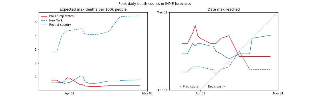
At state level the forecasts weren’t quite as spot-on - New York was much harder hit, and the more sparsely populated Pro Trump states have been minimally impacted:

Looking at the history of IHME forecasts, we can see that the initial forecasts pictured above were corrected within a few days (below left). What’s especially remarkable is how consistent the IHME has been with their predicted timings (below right) - they were spot on at the outset predicting when peak deaths would be reached in New York, and were off by just a few days for the rest of the country:
Given how accurate the predicted timelines were, we decided to look ahead and see when IHME is expecting daily death counts to drop to a point where social distancing can begin to be relaxed. They define this threshold as 1 case per million; as we don’t have their actual case count estimates, we looked instead for expected deaths to fall below 1% of that (1 death per 100m):

As deaths lag infections, the above estimates are fairly conservative. It should be safe to start easing social distancing in New York in late May, and across the rest of the country in late June.
It is worth noting that since April 17th IHME forecasts have been incorporating phone geolocation data, so they are worth continuing to keep an eye on.
PART V. FURTHER OUTBREAKS
For things to return to normal in the absence of an effective treatment / vaccine we would need to start approaching herd immunity, which requires about 70% of the population to have contracted COVID.
Applying the same methodology used in Part II to estimate how many cases are going undiagnosed, we can see that at state level the US is still very far away from herd immunity even in the hardest hit states:

The situation looks better in New York City - the worst hit boroughs are almost half-way to herd immunity:

Assuming that contracting COVID provides immunity, the above suggests that the very groups most vulnerable will be at least half-way to reaching herd immunity - making the city as a whole much more resistant. Even if Seoul sees additional spikes in case counts, it can be argued that New York would fare better.
For the rest of the country the challenge is that in spite of having been less affected, to ensure safety social distancing will need to be maintained for longer - and the timeframe will get more drawn out if / as they continue to open up prematurely. South Korea’s experience demonstrates that a quick easing of social distancing outside major urban centers does not guarantee further outbreaks but the timing and speed with which many US states are reopening suggests that the experience here may be different.
FURTHER READING
If you would like to do some additional reading, we would recommend the following:
It has been speculated that the percentage of cases exhibiting no symptoms is much higher than the widely cited 20%. It may be, but not by much. This analysis of the Diamond Princess cases places it around 35%. Iceland’s analysis reports that 43% cases have been asymptomatic but some of those had simply not yet progressed to symptom onset; applying a rough adjustment for pre-symptomatic cases we get to a true asymptomatic percentage of around 30%.
A similar approach can be taken to estimate fatality rates. For the Diamond Princess, this analysis estimates that the fatality rate was 1.3%. Iceland reports that among the 1300 resolved cases there have been 9 fatalities, implying a fatality rate of 0.7%. In our own work we picked a ballpark fatality rate of 1% to estimate how many cases are being diagnosed and what fraction of the population has been infected.
According to Nextstrain, there is so far no evidence to suggest that there are any clinically distinct strains of COVID-19.
For insight on how small business continue to be impacted, regular updates from a team at Chicago Booth offer finer insights than what the publicly available version of the source data from Homebase can provide.
DISCUSSION
We are in the process of launching an invite-only Augvest chatroom to facilitate further discussion while our regular events are on hold. If you would like to join, please register here: